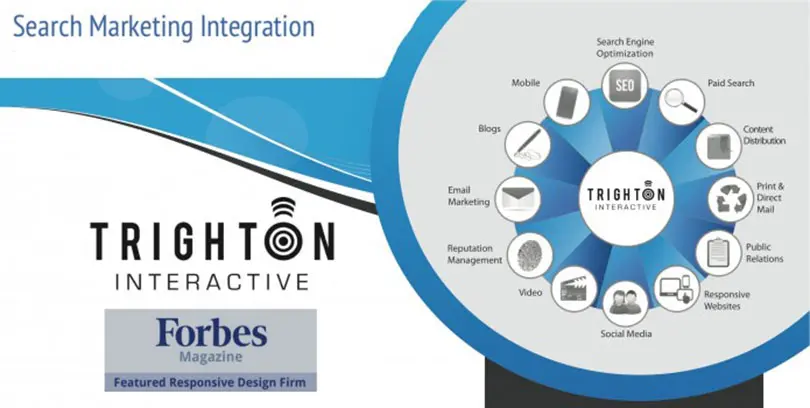
Search Marketing Integration in a Multidevice World – Is Responsive Design The Answer?
The vast majority of consumers use a multitude of devices throughout the day. Perhaps they start on a smartphone, check their tablet on train commuting to work, use a pc all day at the office, check the smartphone periodically and finish the evening at home on a tablet or Internet via TV in bed.
Because of this multi-device usage, it’s crucial to highlight Search as an integral part of the experience on each device throughout the day. People rely on Google, for better or worse, to direct them to the same content they were researching on all devices. The unfortunate reality is that many businesses are still grappling with how best to address the multiscreen world of 2013 and beyond. Business need to understand core fundamentals of Search Marketing Integration.
It’s undeniable that the mobile and tablet explosions have transformed consumer behaviors, and marketers are racing to keep up. The latest and greatest in SEO, SEM, and analytics from 2012 is old news; 2013 is a new era in which integrated online marketing strategies deployed primarily through websites that respond optimally to the device upon which they are being viewed and to the people using them are becoming necessary.
Most businesses understand why they should have a traditional and mobile website, but not enough are questioning the wisdom of multiple sites for multiple devices. Having unique websites for each device can be a complicated mess of mixed analytics, multiple content management tools, and complex paid search and SEO strategies that are difficult to track.
To simplify the challenges facing marketers today, Trighton Interactive focuses on enhancing the user experience – meeting and exceeding their expectations at every step of the consumer journey – by providing an online experience that is responsive to screen size and users’ intentions. That is, by employing a responsive design tactic, we develop strategies that adapt the web experience to meet users’ expectations.
Search Marketing Integration with Responsive Design = Very Powerful
With a responsive website, consumers can easily access and navigate through the same content on all of their devices. As I explained to Susan Gunelius, a contributor to Forbes.com, (Forbes Article) “Responsive websites provide continuity between different viewing contexts, remaining completely agnostic to the type of device used and the size of the screen it has. What this means is that the same website will present an optimized layout regardless of which device it finds itself being loaded in.” Moreover, marketers can now optimize the user experience for each screen. For example, someone using a smartphone to access an airlines’ site is more often checking flight status or checking in for a flight than searching for flights and checking prices. The truly responsive airline website can provide the more probable options first and foremost, thereby enhancing the user’s experience.
With a responsive tactic, internet marketing and SEO are also simplified and enhanced. The same goes for analytics. One set of analytics. And having only one URL makes it easier for search engines to discover content and for Google’s algorithms to assign indexing properties to content. With only one responsive website to manage, marketers can take a unified approach to integrated content management and focus on the user experience to increase conversion and ultimately profits.
Don’t hesitate to contact us to discuss Search Marketing Integration, Responsive Web Design, or any other project you may have in mind – 800.407.2068
Connect on Google +

