With this week’s release of the new “resolutionary” iPad 3, Apple has once again spurred public discussion of the potential of mobile devices, especially tablets, to transform our lives. In the New York Times (March 5, 2012), Brad Silverbert, a former Microsoft executive, talking mainly about the iPad, was quoted as saying, “Tablets are on fire, there’s no question about that,” and research shows that tablets are poised to overtake the PC market within the next few years. (In 2010, PCs outsold tablets 20 to 1; in one year, the ratio decreased to almost 6 to 1, with over 50.7 million U.S. adults currently using tablets.)
Whether an iPad, a Kindle Fire, a Nook, or one of the other available tablets, the reality is that consumers are turning to their tablets for high resolution, interactive digital experiences. And this trend will increase as different hardware manufacturers release new products based on Windows 8 and the younger, tablet-savvy generation grows in consumer power.
What this means for businesses is a new way of thinking about web sites. Simply put, web sites cannot be designed for PC access only because consumers looking for products and services on their tablets will quickly surf away from a website that does not load optimally.
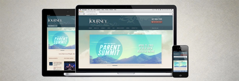
A recent survey of e-retailers conducted by Internet Retailer showed that 63.3% are considering redesiging their web sites so they load better on tablets. While some e-commerce experts recommend investing in t-commerce site design, Trighton recommends Responsive Web Site Design. Responsive Web Site Design can ensure that your web site provides an optimal experience for consumers by responding to the exact device (tablet, smartphone, etc.) they are using. In addition, responsive design eliminates the need for a different web site design and development phase for every new gadget on the market.
To explore the possibilities of responsive web site design, check out Trighton Interactive’s demonstration site at iResponsive.com or read the Internet Retailer press release on Trighton’s Responsive Web Site Design.
Join the conversation on Google+